Tips to Optimize Lazada Product Images
When creating product images, many sellers look at it from a seller’s perspective, not a buyer’s. This means that sometimes, when a product is initially launched — although informational — the image fails to engage potential buyers and convert them into sales.
Although underestimated, an effective product image has the ability to convince someone who is still on edge on whether or not to buy from your store into becoming a regular customer. The question is, how do you do that?
Read: Optimize your Shoppee and Lazada Product Listings with AI!
It all boils down to an optimized product image. An optimized product image answers buyer questions before it is even asked, forms a connection with potential buyers AND captures their attention.
Here are some of the most effective ways to optimize your product images
1. How do you emotionally connect with your buyers?
Before creating a new product listing, the most important thing to keep in mind to create a highly converting product listing is: to put your buyer’s cap on, do not think too much as a seller but as a buyer.
Lazada is getting more and more competitive everyday with more than 125,000 sellers competing for page views on Lazada. As one of the Lazada sellers, you need to stand out from the competitors by creating product listings that can emotionally resonate with the buyers.
So how to you know what your buyers are looking for? There are two types of customers: 1) The ones who already know what they want and purchase quickly one product, and 2) The ones that do random search to bring them to certain options and have no decisions made up.
Not all customers entering Lazada know specifically which products they want to buy. So as a seller, you need to focus on customer type 2 to catch their attention by using the right types of images. Having good catching product images therefore is the first step to get the buyers clicking on your product listing and convert.
2. Types of images you should use for your product listing
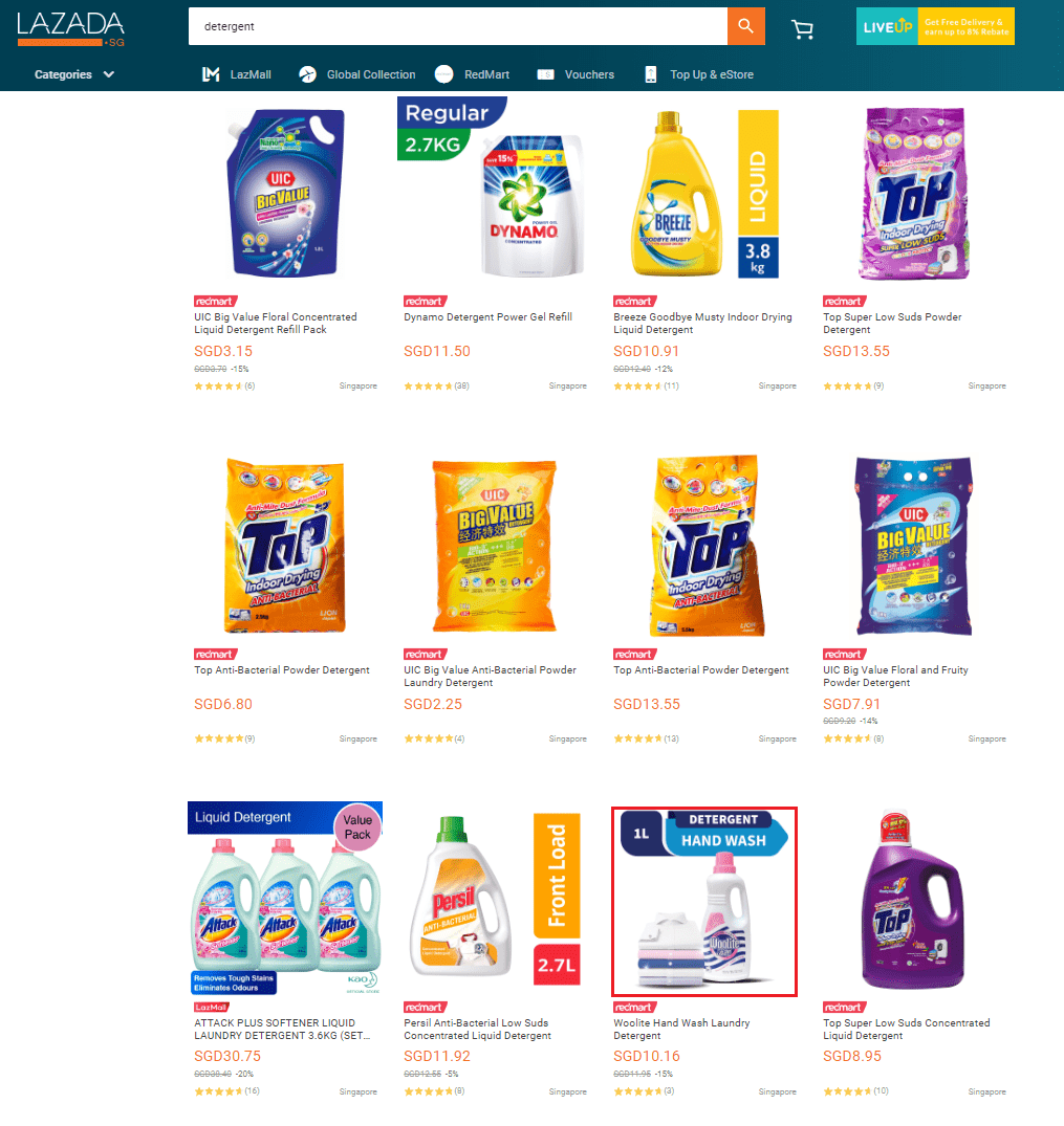
- Main product image: This is the image that appears on the search results along with other competitors. Your main image should have high-fidelity and be able show the details of your product when zooming in. Make sure to have a white background, with no extra text around. One of the common mistakes is that, the main image picture does not fill up the white area to the edge of the picture frame, making the product image looks smaller compared to other products in the search results.
For example, for the product in red border below, the main image is much smaller compared to the other competitors. That also makes it hard for the potential buyers to read the label.
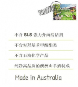
- Lifestyle image: This type of images shows your product in action, or lifestyle setting. This helps to emotionally connect with your buyers as it is a good way to show how your product proportionally looks like in real life. Good examples are as below:

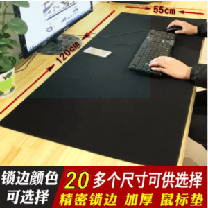

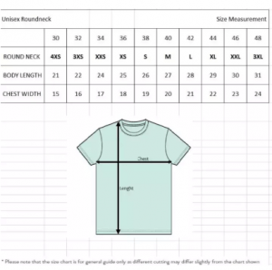
- Infographic image: Images with text and graphics to illustrate more details about the product, such as instructions how to use, or details on different sizes of a product.

3. What are the niche themes of your products?
Depending on the type of your products, there are different “niche themes” that you can connect with your buyers. Product listings with the right niche theme can resonate well with the buyers as they provide the details and type of images the buyers are looking for. I wrote a blog post on learning about your competitors, this strategy can also apply here to discover the niche theme for your product images.
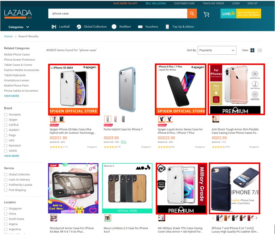
For example: for iPhone case products shown on the first page of the search result, you can see many main images show the front and back of the iPhone case in the search results. As the result, this is the main type of images that resonates better with the buyers and has more success in converting.
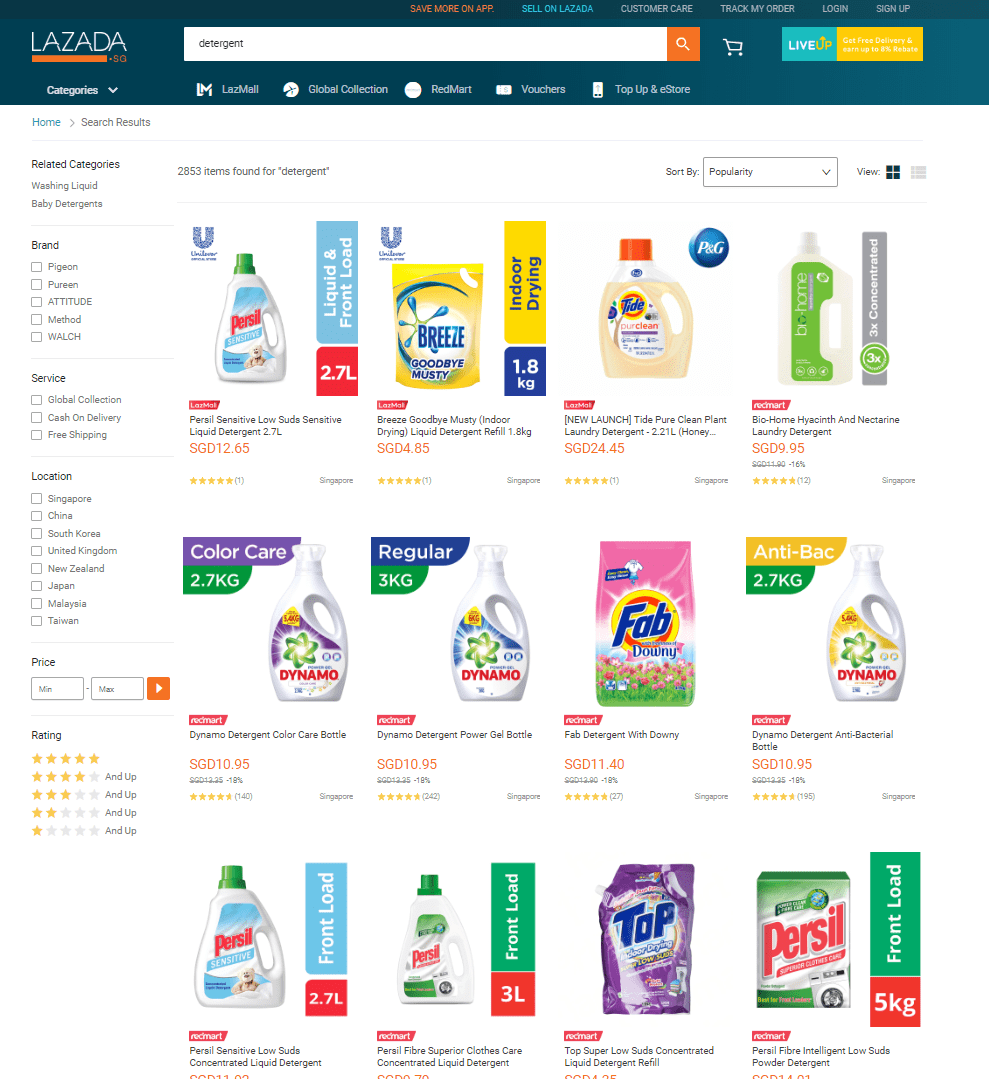
Similarly, in a different example of detergent products (below) appeared on the first page of the search results. You can see most of the images have some info-graphic that highlight the unique features of the product, such as “liquid front load”, “indoor drying”, “color care”, “anti-bac”, or different sizes of “2.7L”, “1.8kg”, etc. So, to create a high performed product listing for this product, make sure to highlight their unique features.
By knowing how to optimize your product images, you are able to answer the unasked questions of potential buyers, build your credibility as a trustworthy business and overall enhance the buying journey of your consumers. And, in this day and age, customer satisfaction is the bread and butter that propels a business to success.
Want to stay on top of the competition?
Split Dragon offers support with your e-commerce needs using conversion-Focused tools and data-driven solutions. Contact us today to see how we can help you with tailored strategies that will drive your company’s success!


