You’ve already optimized your product listings. You used the right keywords and even wrote an enticing copy. But for some unknown reason, you still seem to be missing out on your sales.
If that sounds like you, please keep reading.
Take a look at your product images. Are your product images highlighting the best qualities of your product?
A product image can attract your customers’ attention. And it can also seal the deal, especially in online marketplaces like Shopee.
If you don’t have a good product image, your target audience will be hesitant to buy.
Now, if you’re wondering how to optimize product images, we’ve got you covered.
Here we’ll show you:
– the latest Shopee product image guidelines
– how to choose a compelling product image
– and the tools you need to ensure that you have the best product image for your listing
What is a high-quality and descriptive product image in the marketplace?
A high-quality and descriptive image is a clear photo that shows the benefits of a product and highlights its best qualities.
It should match your description and reassure the buyers that their money will not go to waste.
Compare the photos below.
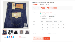
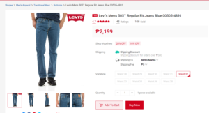
Which product image do you think is legit and authentic?
Both shops claim to sell Levi’s™ denim but they’re not the same. How can you tell? Simple. Look at the quality of the photos they uploaded.
When it comes to selling products in online marketplaces like Shopee and Lazada, you need to do everything you reasonably can to make your product stand out against other product listings.
Aside from standing out, why would you need to improve product images in Shopee and Lazada? For one thing, you’ll be less likely to get refunds.
Because rich, high-quality product images generate more sales and are less likely to receive returns.
And here’s why:
You will make a good impression
In online marketplaces, a search yields many results in a second, so making a lasting impact is crucial.
It only takes a millisecond for your customers to process their first impression of your product listing, and the first thing they’ll see is your product image.
What’s more, customers usually only want to view products they’re interested in. And having a good, descriptive image will show them precisely what they’ll be getting.
In short, you’ll be meeting the visual demands of your customers through good picture quality.
It helps with the SEO
Shopee and other online marketplace search engines want to provide the most relevant search results to the customer. And one of the things these search engines look at is the image quality.
For your products’ images to be picked up by the search engine, they have to:
- Show your product unwrapped
- Be crystal clear
- Noticeably display the brand
- Send a clear message and not cause confusion to the viewers
- Focus on the product
- Have only the minimum required amount of text
- Keep related graphics to the image also to the absolute minimum
- Be shot in a well-lit environment
- In high resolution
- Show the product zoomed out and uncropped
Bonus points if they provide a 360-degree view.
And there is more we can say about Shopee’s product image guidelines, so we’ll revisit it later.
Improves sales connection
Since your product image helps build the first impression, it’s naturally connected to your sales. It’s one of the deciding factors for whether your target customer will buy from you or not.
When your buyers see that your product has a high-quality image, what do you think it tells them?
It signals to your buyers that you are legit.
You know that there are fake sellers inside marketplaces. You also know the reason why there are a lot of cheap items inside the marketplace is that they allow imitation products. So the quality of your images will help your products shout out loud that they’re the real thing.
Moreover, if you have resellers or retailers, you can also ask them to use your images.
Providing great photos for them reduces their chances of them using poor product images and helps avoid ruining your brand.
Online marketplace product image guidelines
Now that we’re done with the fundamentals of how to improve your product’s images, let’s go over the product guidelines of Shopee and Lazada:
Shopee product image guidelines
To recap, the main objective of Shopee’s product image guidelines is to make sure that shoppers will have the most relevant search results with a high image resolution.
Here are the key factors and their guidelines:
Number of images
You can upload up to 9 images.
This includes the cover image for each product and additional images for each product variation (color, size, etc).
Shopee relevance
- The product image and its brand should be clear
- All product images must be related to the product listings.
- Images only have the necessary text and related graphics
Shopee photography style
- The item should be well-focused and shot in a well-lit environment.
- It stands out from the background
- The product should cover at least 70% of the entire image
- It must include a front shot
- Offensive Images will be immediately removed
Shopee image dimensions
- The minimum dimensions are 500 x 500 pixels
- The minimum resolution is: 72dpi
- Product proportions must not be distorted
Lazada product image guidelines
Here are the mandatory requirements for Lazada’s product images:
- The image format must be JPEG
- Pixel dimensions are up to 1600 x 1600 pixels
- White padding can be from 80 to 100 pixels around the product
- Background must be white (RGB code 255 255 255)
- The minimum resolution is 72dpi
Tip: Did you know that Lazada also offers product photography? SnappyFly is Lazada RedMart’s photography partner.
SnappyFly images can also be used on other websites and channels you own.
How do make Lazada and Shopee’s product image better?
A good product image requires an intentional strategy. You can’t just take a picture of your product and hope for the best.
A good picture will attract customers, and a good picture will also help convert those clicks into sales.
Here are 5 tips to make your product images better
1. Pick a nice camera
By nice camera, we mean a camera that can shoot high-quality, high-definition photos. The good news is that the latest smartphones right now have cameras that can shoot high-quality and high-definition photos. So you won’t necessarily have to buy a professional camera to take good pictures.
That said, if you would like to have a dedicated camera for your products, a mid-range model like a Sony A6100 can do the job. As long as you know how to take high-quality product images, you’re one step away from getting picture-perfect product images.
2. Use a white background
This is a pretty standard rule for product images.
And here’s why.
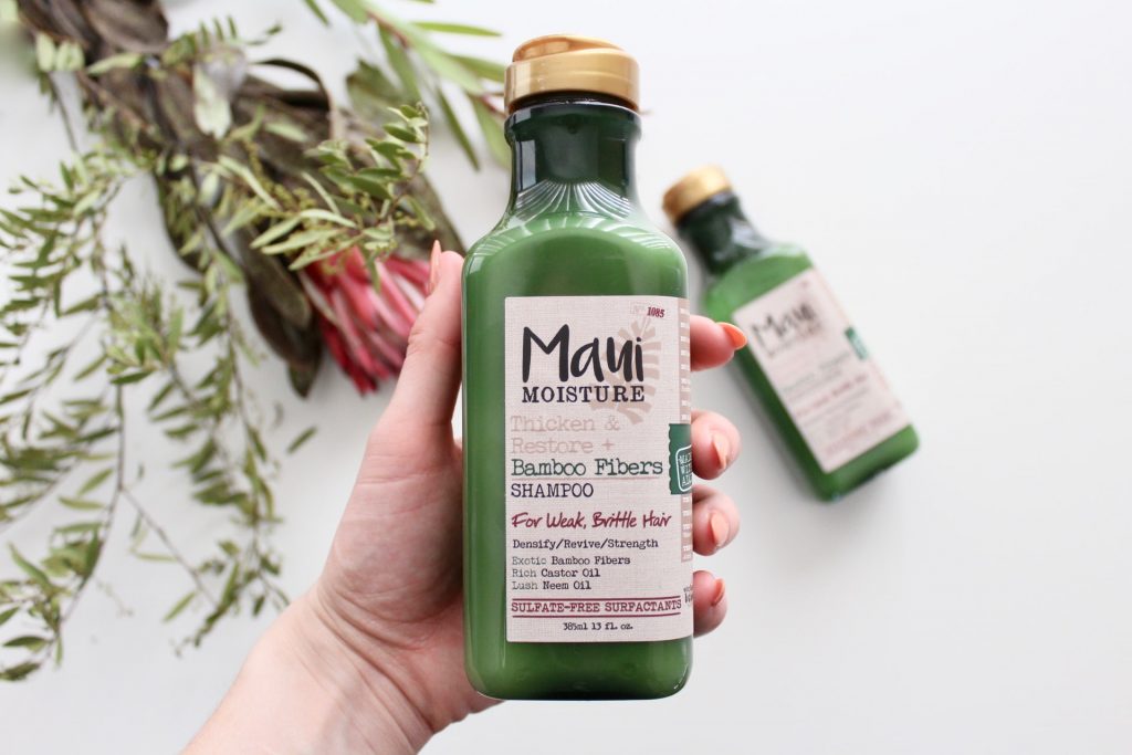
A white background can enhance the little details that you want to emphasize in your products.
And it doesn’t have to be a boring white either. You can play with the angles or put some elements on the background, as long as it does not look distracting and the details you need to show are still clear.
Source: Maui Moisture
3. Ensure good lighting
To prevent dark and shadowy images, aside from using a white background, make sure that you have good lighting.
You can buy professional lights for more oversized items or just a lightbox where you can play around with the lighting and angles.
Use the lighting as a tool to enhance the different parts of your products.
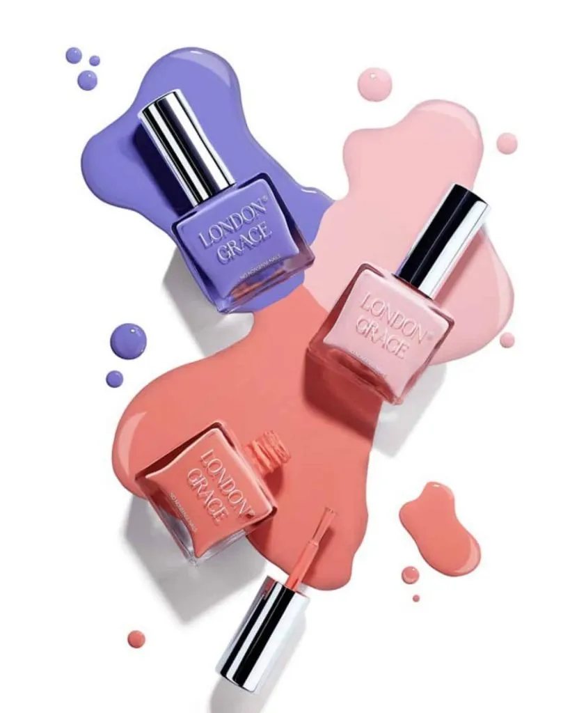
Source: London Grace
4. Highlight your product’s best features through angles
Depending on the kind of product you’re selling, you will most likely have to use more than one angle.
Here are the top angles that you need to consider:
- Front angle
This is the most common and also most important angle as it copies how your customer might see your product during their first encounter. So, it brings familiarity and confidence.
- Side angle or profile angle
A profile angle shows the side view of the product. This angle comes in handy when you want to showcase specific features of your product or its brand.
For example, if you’re taking a photo of a pair of sneakers, the side angle can highlight the design or the height of the shoes, which can also be the main selling point.
In contrast, the side angle of a bottle of lotion may not be as useful for highlighting features. So take pictures of these only when it makes sense for your kind of product.
- 45-degree angle
This angle is perfect if your product has a different design all around and you want to highlight its two different sides. It can also catch more details compared to the front angle and side angle.
Please note that, despite its name, this angle does not have to be exactly 45 degrees. You need to play around a bit until you get the best angle for your product to get all of its necessary details.
- Back angle
The back angle can be used to showcase information that’s shown on the backside of the product. Usually, this is the last image shown on the product’s page as it does not show any branding or eye-catching design.
5. Do a lifestyle shoot
When you don’t have a physical store, customers don’t have the chance to know exactly what they’re getting — and lifestyle images can help fill in that gap.
A lifestyle shoot focuses on portraying a product in a slice-of-life setting. It shows how the product may look in real-life situations, which your customers will identify or relate to.
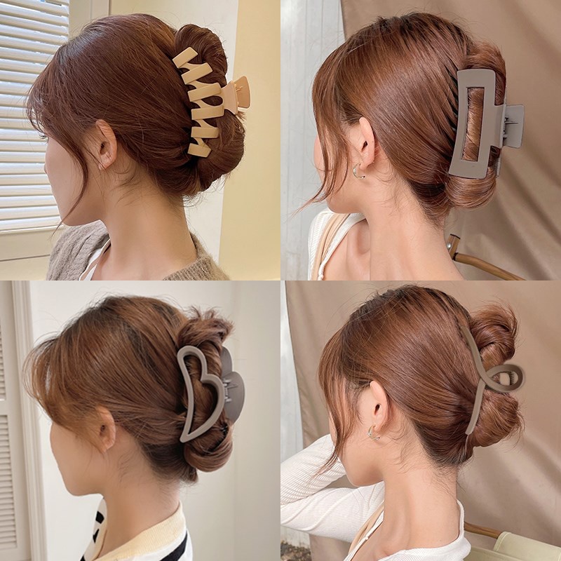
Lifestyle images can help customers see themselves using the product or service to make them feel more connected to the brand.
6. Use a tool to test your product listings’ images
One of the best things when selling online is the availability of tools to help improve your selling experience.
If you want to help ensure that you’re posting winning product images, you can try split testing.
Split testing in online marketplaces can help you choose the most profitable product listing using data, so you don’t have to guess and hope for the best.
And, yes, both Lazada and Shopee actually encourage you to do split testing for your benefit and for the buyers, too!
Nail your eCommerce Photograph Strategy
“A picture is worth a thousand words.”
This is a well-known saying in the advertising industry and it’s stood the test of time for a good reason — it’s the truth. A single photo can deliver your message better than a thousand words. Remember, poor product visuals will hamper conversions.
Investing in a high-quality product image is the first step to enhancing your product listings. And when you’re a start-up, you can start with a DIY approach for your product image strategy, using the tips we discussed in this blog post.
And while you’re at it, take one more step by doing split testing to ensure that you’re publishing the best version of your product’s images in Shopee or Lazada.
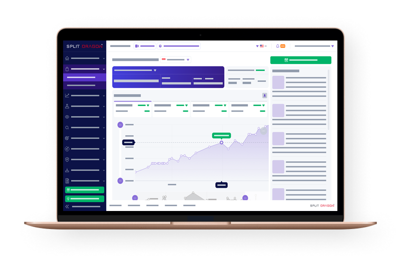
Split Dragon offers a free trial for Split Testing. Check it out here.


